
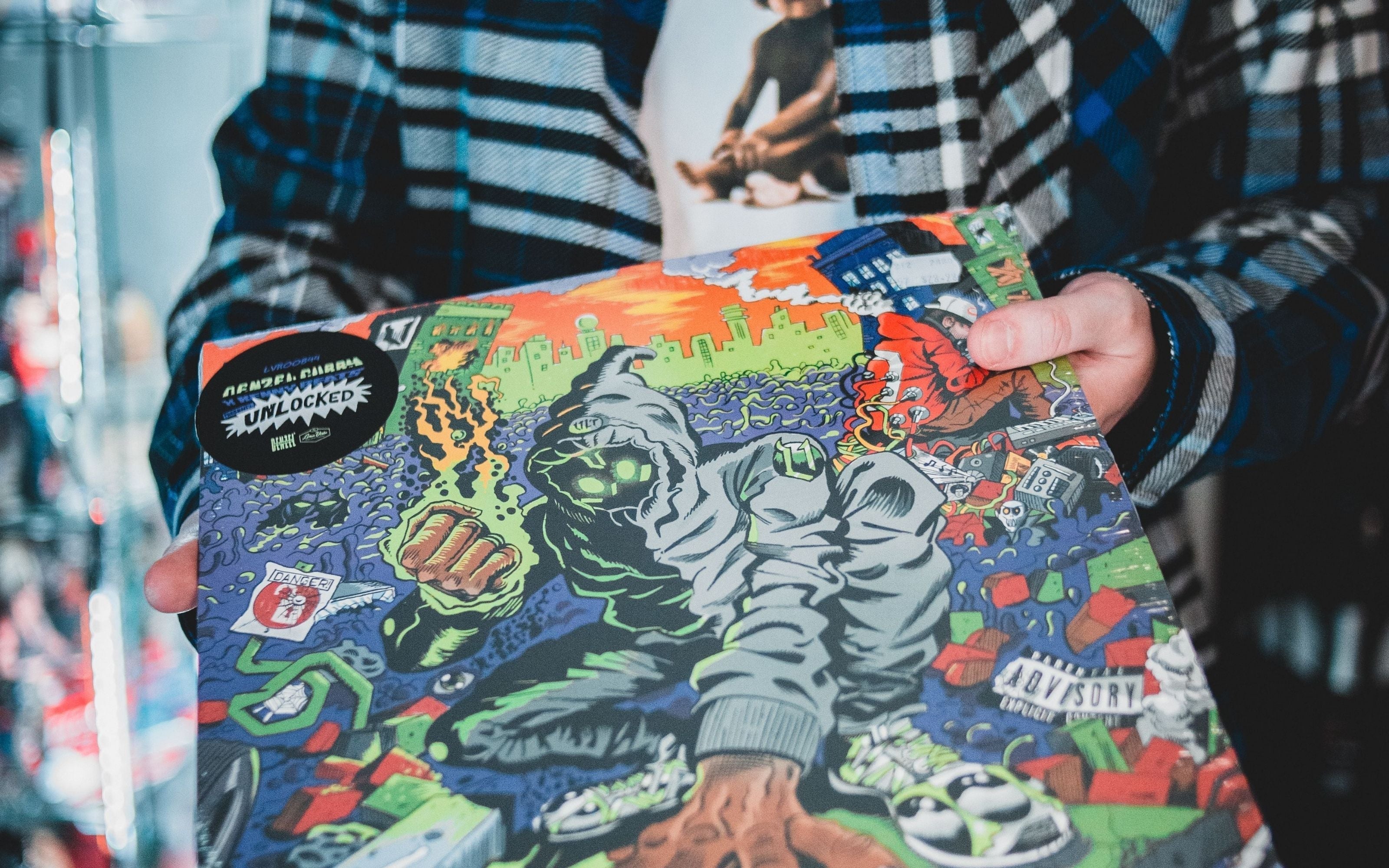
They're designed with intention.
One of the easiest ways to create a professional-looking record is by matching the vinyl color to the album artwork.
When the cover, labels, and vinyl all work together, the finished record feels cohesive, premium, and visually memorable.
Whether you're creating a personalized gift, wedding record, anniversary keepsake, or your own custom album, color coordination can make a dramatic difference.
Why Color Coordination Matters
Your vinyl record is more than just a way to play music.
It's also part of the presentation.
Matching the vinyl color to your artwork helps create:
- A cohesive design
- A premium appearance
- Better shelf appeal
- Stronger visual storytelling
- A more personalized keepsake
Many of the best-looking records use a consistent color palette across every design element.
Start With Your Dominant Color
Before choosing a vinyl color, identify the dominant color in your artwork.
Ask yourself:
- Which color appears most often?
- Which color immediately catches your eye?
- What color represents the mood of the design?
Using the dominant color often creates the cleanest overall appearance.
If your artwork contains several colors, you may instead choose the strongest accent color.
The Image Color Picker Tool makes this process quick by extracting colors directly from your artwork or photos.

Think About Contrast
Matching doesn't always mean choosing the exact same color.
Sometimes contrast creates a stronger visual effect.
For example:
- Dark artwork + bright vinyl
- Light artwork + bold vinyl
- Neutral artwork + vibrant accent color
Contrast helps important design elements stand out while still feeling coordinated.
The goal is balance—not necessarily perfect color matching.
Preview Before Ordering
Colors often look different in your imagination than they do on an actual record.
Before making your final decision, preview your options.
The Record Color Preview Tool allows you to compare colors before production, helping you avoid combinations that may not work as expected.
Using both the Image Color Picker Tool and the Record Color Preview Tool together creates one of the easiest workflows for designing a custom record.

Popular Color Matching Ideas
Some of the most successful projects include:
Wedding Records
Matching wedding color palettes.
Graduation Records
Using school colors.
Personalized Gifts
Matching favorite colors or meaningful artwork.
Music Projects
Coordinating vinyl with album branding.
Family Keepsakes
Pulling colors directly from photographs.
For additional inspiration, explore Best Vinyl Record Gift Ideas for Every Occasion and Personalized Color Vinyl Records.

Small Design Decisions Create Big Results
Choosing the right vinyl color isn't about following rules.
It's about reinforcing your story.
When your artwork, photos, labels, and vinyl all work together, the finished record feels intentional from every angle.
For more inspiration, explore How to Design a Personalized Vinyl Record, Color Vinyl vs Black Vinyl, and Custom Vinyl Records With Photos.

Ready to Match Your Vinyl to Your Artwork?
A coordinated design can transform a custom record from something that looks good into something that looks professionally designed.
Choose colors that support your story, complement your artwork, and create a record you'll be proud to display.
Design your custom color vinyl record today.